
29th March 2022
Decorating with a neutral design scheme
Take a neutral palette from your kitchen diner right through to into every room of your house and get easy show home style in your very own home. Here's how...
Neutral decorating tips & tricks
Whatever your taste, using a neutral colour scheme creates a calm, cohesive and professional-looking home without any fuss. Using your favourite furniture, accessories and other decorating elements whilst keeping to a neutral colour palette, will create an interior scheme that will never go out of style.
A kitchen, lounge, bathroom or bedroom with a neutral design is an extremely soothing environment to spend time in. You can create a neutral look throughout every room of your home easily and simply by mixing different textures and styles for your walls, soft furnishings, flooring and accessories from within this palette, without losing any cohesiveness in the overall effect, as the overall look will be harmonious.
WHAT ARE NEUTRAL COLOURS?
Neutrals for interior design include beige, ivory, taupe, cream, black, grey and shades of white. Using natural materials like wood, wool, cotton, rattan and pottery in your neutral decoration scheme is an easy way to pull in those natural shades too.
Within this family of neutral colours, there are numerous variations of either cool or warm tones, all of which can also be brought in using fabrics, wall paper, paint, soft furnishings and kitchen finishes too.
TIP: It’s best to try test samples before you totally commit. The shade you love may look totally different next to your other decorative choices in situ.

HOW TO ADD DRAMA TO A NEUTRAL SCHEME
Neutrals can be used for interior design in two ways - either as a soft, neutral only, natural look, or as background for dramatic accents.
- If you are going for an all-neutral look, try layering different hues of the same colour. Keep an eye on the individual tones however, to make sure there is enough contrast.
- If you want drama, try adding a strong contrasting element such as black or a totally different light or dark colour.
- Before you commit to your choices, observe the light in your home at different times day. Neutral colours in particular, can look different at certain times of the day.
- Metallics and mirrors bounce light around your room, furniture can create shadows on the walls, and fabrics can absorb the light – all of which can change the colours of your scheme depending on the light variations.
TIP: Brighter neutrals give your room a more open, fresh and breezy look, whilst muted or darker neutrals give your space a cosier appearance.
USING BLACK OR DARK BROWN
If you’d like to make more of a statement, but want to keep a neutral scheme throughout your home, try adding some black furniture, ornaments and mirrors etc, which will act as a strong contrast to your natural scheme, whilst still sticking to a natural palette.
Black can make your scheme pop and is super cool in any interior space. If you want a slightly softer contrast, try a dark brown instead.
TIP: Experiment with darker accents in your furniture choices, such as installing a wall-mounted media unit, contrasting kitchen cabinets or an arcus, black framed mirrors or a painted metal coffee table, for an ultra-modern look.


Caption: Darker accessories on a neutral background stand out in every room of the show home
ADDING LUXURY WITH METALLICS
Another way to add drama to a neutral scheme is to sprinkle metallic accessories such as mirrors, candle holders, ornaments & planters throughout your home.
This design trick adds reflective surfaces and a subtle shine, as well as a touch of sophistication and decadence to your look.
TIP: Add warmth to neutral tones with gold, brass or copper accents. For a cooler look, add silver-coloured accessories to your scheme.
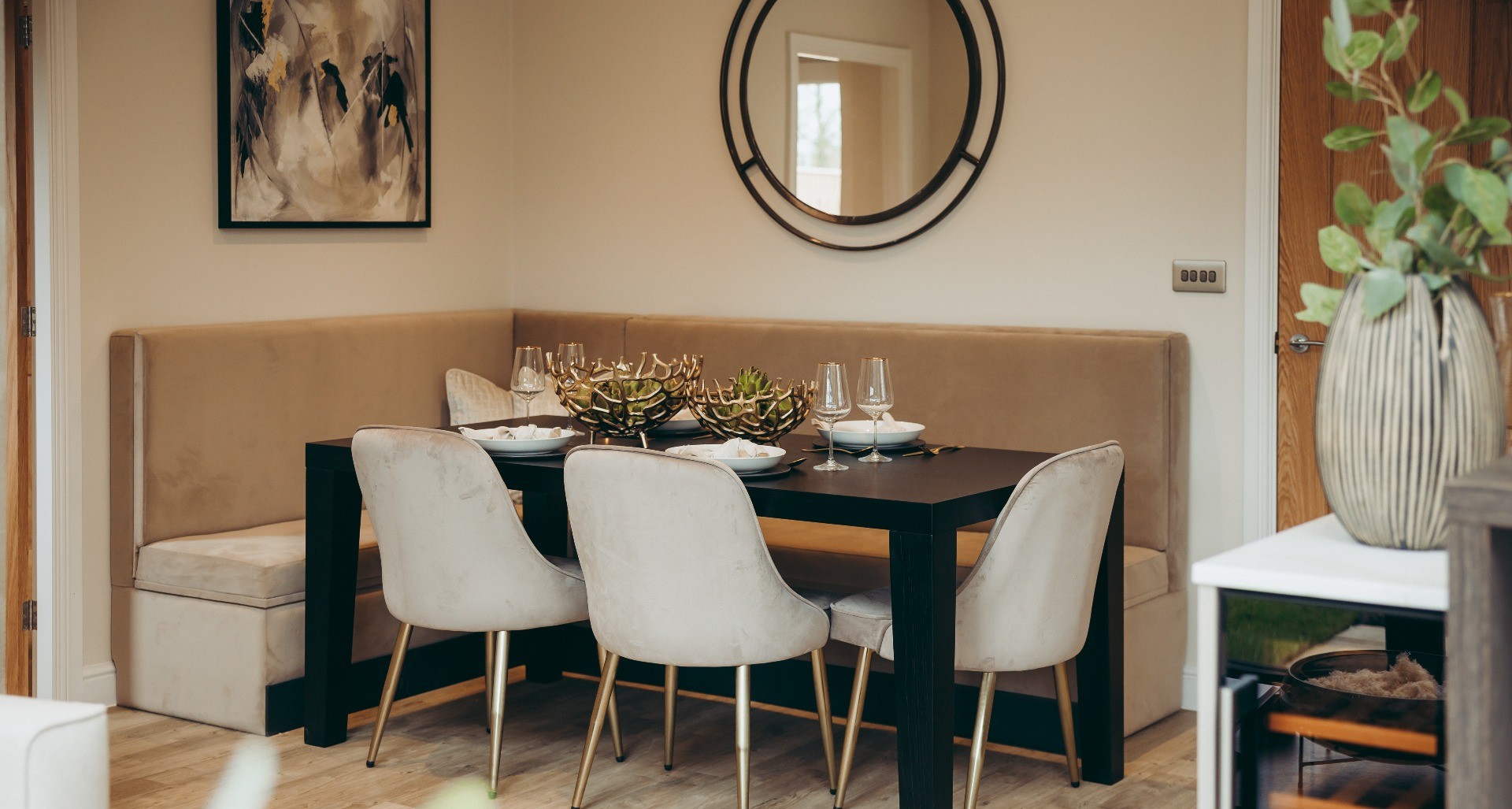
Caption: The warm metallics in the wall clock, fruit baskets and cutlery add a glamorous feel to the neutral scheme in the kitchen diner
WOW WITH WALLPAPER
Pops of pattern or texture in wallpaper gives maximum impact to your interior design with minimum effort.
Patterns inspired by the natural world, add softness and visual relief to a neutral scheme, without creating too much contrast. Textured geometric wallpaper in the same colours as the rest of your neutral scheme will add an extra dimension to the overall design, without jumping out too much.
TIP: Changing a feature wall in a child’s bedroom can give them a more sophisticated look as they start to grow up, without a costly redesign.

Caption: This wallpaper gives an interesting focal point to this bedroom whilst still keeping to the neutral palette
EXPERIMENT WITH COLOUR
Neutral elements always stay in vogue, but you may want to add a pop of your favourite colour into the mix.
- Keep the neutral theme as your canvas and add another stronger colour as a contrast, such as lilac, blue or mint – all in the top 10 paint trends for this year. When you fancy a change, it’s cheaper and easier just to swap out your coloured accessories and repaint or re-paper a feature wall with another colour to change your look, without having to totally redecorate the whole space.
- Different finishes of paint such as gloss, satin, eggshell or matt reflect light in different ways, so you can get different effects and textures within a close neutral palette by using them together.
- Neutral walls can really make artwork or other statement pieces such as mirrors, pop.
TIP: Plants, fake or real, add to the overall natural effect, whilst bringing in a different colour into the mix and are another way to create bright focal points.

Caption: Soft pink accents make a statement in this soft grey neutral scheme with cool metallic accents

Neutral interior design The Whittingham Show Home in Longridge
Create's Brand Director and Founder Gill Mathison, chose the Mocha Create Homes Colour Collection for the show home kitchen at The Sandpipers.
The colours and textures of that neutral scheme flow seamlessly through into the interior design of the whole show home.
The addition of light upgraded worktops with a cool veined marble look, add an extra touch of luxury to the nature-inspired design.
Show home kitchen specification:
- Colour Collection: Mocha
- Units: Agate Grey
- Arcus: Terra Larix
- Breakfast bar: Natural Sangha
- Worktop upgrade: Platinum upgrade Oro (veined worktop)
- Peninsular upgrade: Seamless quartz downturn
 Caption: The Mocha Kitchen Colour Collection by Create Homes was the inspiration for the whole interior colour scheme of The Whittingham show home at The Sandpipers, Longridge
VIEW OUR SHOW HOME MAGAZINE

Featured
20th May 2025
Dream kitchen designs at The Groves, Bispham
Every ‘Executive Collection’ home at our intimate development in Bispham, has a quality Stuart Frazer kitchen/diner at its heart. Explore the choices available to personalise your new home.

Featured
11th May 2025
Our Create Home: Elizabeth & Alex
Our customers Elizabeth, Alex & their dog Matilda open the doors of their new home at The Sandpipers, Longridge to share their unique interior style and tell us why they chose Create Homes.

Featured
1st May 2025
Energy efficient new homes at The Groves, Bispham
Create Homes offers new build homes at The Groves, Bispham in Lancashire with traditional red brick façades and quality designer style... plus lots of energy-saving efficiency built in.

Featured
1st April 2025
Discover your new home by the sea in Bispham
If you are thinking of buying a new home on the Fylde Coast in Lancashire, The Groves, Bispham is the perfect choice, offering 35 high-specification & energy efficient new build homes.

Featured
19th February 2025
Energy efficient homes at Chapel Mill
The house you choose as your next home could have a significant impact on your energy bills.

Featured
18th February 2025
Achieve your dream Create Home with Shared Ownership
We have partnered with Heylo to provide shared ownership homes to help people get on the property ladder at our stunning village development, Chapel Mill in Elswick.

28th January 2025
How to create your own outdoor haven
Got a brand new home and garden? Reuben Davenport from Landscapers W J Wilkinson & Sons, Preston gives Create Homes buyers some hints and tips on making their large outdoor garden a haven.

19th November 2024
Visiting Our Sites Safely
Your safety is very important to us, so please take a few moments to read this important safety information before you visit any of our construction sites.

26th October 2024
Buy to let a new build home near Preston
If you are looking for a hassle-free investment opportunity, then buying a new build home is a fantastic option.

18th October 2024
GET THE LOOK - The Ribbleton Show Home
The team at Create Homes knew that the new Ribbleton show home, in the exclusive and award-winning location of Elswick village, needed a REALLY SPECIAL design team to get the perfect look.

4th July 2024
Live your best life in Chapel Mill, Elswick
It’s all about the location! Create Homes has secured a rare opportunity to build new homes in the beautiful village of Elswick on the Wyre, Lancashire.

17th June 2024
How to personalise your Create Home
Every Create Home offers you exceptional designer style and quality as standard. But there’s a lot more on offer to make your new home more personal to you.